Advanced Typography | Task 2
22 May 2024 - 12 Jun 2024 | (Week 5 - Week 8)
Chan Xiang Lam | 0358400
Advanced Typography | Bachelor of Design (Honours) in Creative
Media
Task 2 | 2A & 2B
Table Content
1. Lectures
-
2A
: Key Artwork
-
2B
: Collateral
Lectures
Lectures 1 to 6 completed in
Task 1
Week 5 Lecture 5 | Perception & Organisation
Perception
- Definition: Perception is how something is regarded, understood, or interpreted. In typography, it involves visual navigation and interpretation via contrast, form, and organization of content.
- Focus: Typography deals with how textual, visual, graphical, and color elements are perceived and understood.
Contrast
- Size: Large elements draw attention first, such as a big letter standing out against smaller letters. Commonly used to make titles or headings more prominent than body text.
.png)
Fig.5.1 Contrast of size
- Weight: Bold type can stand out amidst lighter type of the same style. Other methods include using rules, spots, and squares to create heavy areas for visual emphasis.
.png)
Fig.5.2 Contrast of Weight
- Form: Distinction between different letter forms like capitals and lowercase, roman and italic, condensed and expanded versions of a typeface.
.png)
Fig.5.3 Contrast of Form
- Structure: Different letterforms of various typefaces, such as monoline sans serif versus traditional serif, or italic versus blackletter.
.png)
Fig.5.4 Contrast of Structure
- Texture: Combination of size, weight, form, and structure applied to a block of text. Texture refers to the overall look of lines of type both up close and from a distance.
.png)
Fig.5.4 Contrast of Texture
- Direction: Opposition between vertical and horizontal, and angles in between. For example, turning a word on its side or mixing wide blocks with tall columns.
.png)
Fig.5.5 Contrast of Direction
- Color: Use of color to create emphasis. Consider tonal values to ensure important elements stand out appropriately.
.png)
Fig.5.6 Contrast of Color
Form
- Definition: Form in typography refers to the overall look and feel of the typographic elements, playing a crucial role in visual impact and first impressions.
- Functions: Typography serves to represent concepts visually, providing unique characteristics and abstract presentations of letterforms.
- Interplay: Balancing meaning and form to create harmony in function and expression. Manipulated forms through distortion, texture, enlargement, etc., can transform letters into shapes that are no longer readable as letters.
Organization / Gestalt
- Definition: Gestalt is the German word for the way something is "placed" or "put together." Gestalt psychology aims to understand the laws of meaningful perception.
- Principles: Gestalt principles predict perceptual grouping, emphasizing that the whole is greater than the sum of its parts. Design components are evaluated based on overall visual form rather than individual elements.
Perceptual Organization / Groupings
- Law of Similarity: Similar elements (color, orientation, size, motion) are perceived as a unified group.
- Law of Proximity: Elements close together are seen as a unified group.
- Law of Closure: The mind completes incomplete figures or forms, filling in gaps.
- Law of Continuation: Humans perceive intersecting objects as distinct, uninterrupted objects, influenced by their alignment.
- Law of Symmetry: Symmetrical elements are perceived as unified groups.
- Law of Simplicity (Prägnanz): Elements are perceived in the simplest form possible.
.png)
Fig.5.7 Gestalt's principle of grouping
2A : Key Artwork
Create a key artwork that combines your name as a wordmark/lettering,
serving both as an identifier and a piece of art for various items (lapel
pins, T-shirts, posters).
Instructions:
- Experiment with different permutations and combinations of your name.
- Ensure the final design is elegant, well-balanced, and clear.
- The artwork should be versatile, allowing it to form vibrant patterns while maintaining its visual identity.
The key artwork will be used in future tasks, especially in Task 2(B),
where it will be applied to various collateral items. The goal is to have
a visually striking and functional design that adapts well across
different applications.
Progress
1. Ideation and sketches
I looked for inspiration and references on Pinterest, collecting
various ideas and design elements. After studying these references, I
created several sketches on paper, exploring different styles and concepts.
This process helped me come up with initial design ideas and prepared me for
the next steps in digital work.

Fig.2.1.1 Reference from Pinterest

Fig.2.1.2 Sketches
2. Digitalisation
After finishing the sketches, I digitalized each one using Adobe
Illustrator. This involved tracing and refining each sketch to improve their
details in a digital format.
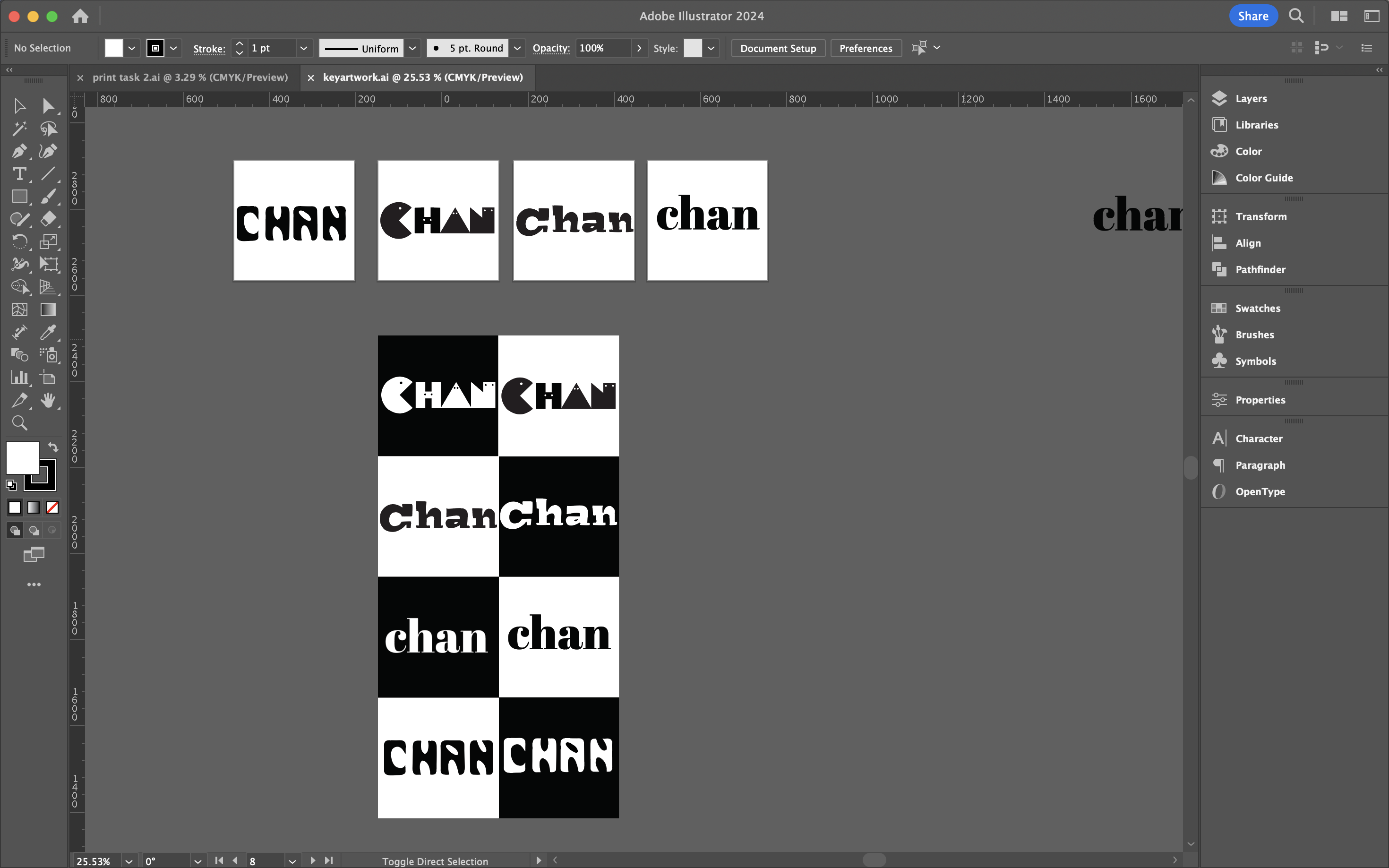
Fig.2.1.3 Process of Digitalisation #1

Fig.2.1.4 Digitizing Drafts

Fig.2.1.5 Process of Digitalisation #2
Next, we were asked to print our key artwork on paper to see how it looks.
Mine looked good, so I can move on to choosing color schemes.

Fig.2.1.6 Tested in Box (175mmx175mm) & (15mmx15mm)

Fig.2.1.7 Animation process

Fig.2.1.8 Black wordmark on White background | Week 7 (6/6/2024)

Fig.2.1.9 White wordmark on Black background | Week 7 (6/6/2024)

Fig.2.1.10 Colour palette | Week 7 (6/6/2024)

Fig.2.1.11 Wordmark in actual colours on lightest shade of colour
palette | Week 7 (6/6/2024)

Fig.2.1.12 Wordmark in lightest shade of colour palette on darkest shade of colour
palette | Week 7 (6/6/2024)
.gif)
Fig.2.1.13 Animation | Week 7 (6/6/2024)
Fig.2.1.12 Final Outcome - pdf | Week 7 (6/6/2024)
2B : Collateral
For Task 2B, we need to apply our key artwork on 3 collateral and create
mockups to showcase a consistent and attractive brand look. Additionally, to
include an Instagram link and a high-resolution screen grab of the Instagram
profile. Mockey
Progress
1. Collateral
The three chosen collaterals for this task are a Jacket, Tote Bag, and Mug.
First, I accessed the Mockey website to utilize its mockup creation tools. i
uploaded the wordmark to each template, adjusting its size and position for
optimal visibility and aesthetic appeal.

Fig.2.2.1 Attempts to place the logo on various
products

Fig.2.2.2 Process #1

Fig.2.2.3 Process #2
Final Outcome

Fig.2.2.4 Collateral 1 | Week 8 (13/6/2024)

Fig.2.2.5 Collateral 2 | Week 8 (13/6/2024)

Fig.2.2.6 Collateral 3 | Week 8 (13/6/2024)
Instagram link: cchan.co
.png)
Fig.2.2.7 Instagram Page Profile | Week 8 (13/6/2024)
Fig.2.2.8 Final Outcome - pdf | Week 8 (13/6/2024)
Feedbacks
Week 5 (22/5/24):
Ensure the artwork is easy to read for everyone. Start designing in
black and white to focus on the basic layout and readability before
adding colors. Use fewer graphic elements to keep the design simple
and clear, avoiding clutter that can distract from the main message.
Week 6 (29/5/24):
Print the logo using the provided format to find and fix errors more
easily. Ensure the artwork is easy to read and unique, adding special
elements that make it stand out. Check that the key artwork stays
clear and recognizable even when it's small.
Week 7 (5/6/24):
Keep designs simple with fewer colors for a cleaner look. Using
monochrome colors can help create a balanced and appealing design.
Represent the product with three different items to show its
versatility and application in various contexts.
Week 8 (12/6/24):
Independent Learning Week
Reflections
Experience:
This task was both challenging and a creative journey. I explored
different designs of my name, "Chan," as a wordmark or lettering.
Extending this design to various items, including an animated version,
a T-shirt, a cup, and an Instagram account, required careful
adaptation to different formats.
Observations:
Through this project, I learned that typography can be art as well as
functional. The key artwork's success depended on how well the image
and type worked together. Consistency and playful elements helped make
the key artwork stand out. Small adjustments, like refining negative
spaces and ensuring even spacing, greatly improved the design.
Findings:
These tasks improved my understanding of typographic communication and
how to create a cohesive, adaptable visual identity. The experience
was both challenging and rewarding, providing valuable insights into
design principles and applications.
Further Readings
Refer to
Task 1
QUICK LINK


Comments
Post a Comment