Advanced Typography | Task 1
24 Apr 2024 - 15 May 2024 | (Week 1 - Week 4)

Week 2 Lecture 2 | Typographic Composition


Environmental Grid: This design system extracts structural elements
from the environment to organize design elements creatively, incorporating
curved and straight lines for visual interest and context.


Week 3 Lecture 3 | Context & Creativity


Evolution of Middle Eastern Alphabets:


.png)


2. Process


Final Outcome

2. Radial System

3. Dilatational System

4. Random System

5. Grid System

6. Modular System

7. Transitional System

8. Bilateral System


2. Reference Font


"Finding Type" is a unique typographic exercise that blends research,
exploration, and creativity to uncover the perfect typeface for a given
project. It begins with a clear understanding of the project's objectives
and audience, followed by thorough research into typographic history and
influences. Designers then search digital and physical sources for typefaces
that align with the project's essence, evaluating them based on various
criteria. The exercise culminates in the selection and refinement of the
chosen typeface to seamlessly integrate it into the project. More than just
a design exercise, Finding Type fosters a mindset of continuous exploration
and appreciation for typography's rich heritage and potential.


Chan Xiang Lam | 0358400
Advanced Typography | Bachelor of Design (Honours) in Creative Media
Task 1 | Exercises 1 & 2
Table Content
1. Lectures
Lectures
Week 1 Lecture 1 |
Typographic Systems
Elam's typographic systems categorize different approaches to organizing text
and design elements, offering a structured framework for designers to create
organized and effective layouts. Here are the eight major variations:
- Axial System: Elements aligned along a single axis, either left or right.
- Radial System: Elements extend outward from a central point of focus.
- Dilatational System: Elements expand circularly from a central point.
- Random System: Elements appear without any discernible pattern or relationship.
- Grid System: Content organized within a framework of vertical and horizontal divisions.
- Transitional System: Informal layering of content in bands.
- Modular System: Construction of content using standardized, non-objective elements.
- Bilateral System: Text arranged symmetrically along a central axis.
These systems provide a balance between structure and creativity, allowing
designers to develop their intuition within defined parameters.


Fig.1 Eight major variations of structural systems (24/4/2024)
Principles of Design Composition: Fundamental principles like
emphasis, symmetry, and alignment guide the arrangement of design elements
for visually appealing layouts.

Fig.2 Principles of Design - emphasis (1/5/2024)
The Rule of Thirds: This photographic guideline divides a frame
into thirds both horizontally and vertically, providing points of interest
for balanced compositions.
Fig.2 The Rule of Thirds (1/5/2024)

Fig.2 Environmental Grid (1/5/2024)
Form and Movement: Explores the concept of movement within design,
treating page turning as a form of animation to create dynamic
compositions that guide the viewer's eye.

Fig.2 Form and Movement (1/5/2024)
Week 3 Lecture 3 | Context & Creativity
Early mechanical letterforms were initially crafted to replicate the
appearance of handwritten script, thus establishing a foundational template
for the shape, arrangement, and conventions of subsequent typographic designs.

Fig.3.1 Evolution of the Latin Alphabet
Cuneiform (c. 3000 B.C.E.):
- Earliest known writing system, evolving from pictograms and written from left to right.

Fig.3.2 Cuneiform
Hieroglyphs (2613-2160 B.C.E.):
- Egyptian writing system combining pictorial and phonetic elements, serving as a precursor to alphabetic systems.

Fig.3.3 Hieroglyphs
Development of Western Handwriting:
1. Early Greek (5th C.
B.C.E.)
- Drawn freehand, without serifs.
- Over time, strokes thickened, apertures lessened, and serifs appeared.
2. Roman Uncials
- By the 4th century, letters became more rounded for faster writing.
3. English Half Uncials (8th C.)
- Evolved into a more slanted and condensed form in England.
4. Carolingian Minuscule
- Introduced capitals at the start of sentences, spaces between words, and punctuation.
- Influenced Humanistic writing of the 15th century and became the basis of lower-case roman type.
5. Black Letter (12-15 C. CE)
- Characterized by tight spacing and condensed lettering, dominated by evenly spaced verticals.
- Reduced material costs in book production.
6. The Italian Renaissance
- Rediscovered and rationalized letterforms (Antica) through renaissance analysis applied to art and architecture.

Fig.3.4 Development of Western Handwriting
- The Phoenician alphabet marked a significant turning point by using letters to represent sounds, influenced by Egyptian Hieroglyphics and Hieratic Scripts.

Fig.3.5 Evolution of Middle Eastern Alphabets
Evolution of the Chinese Script:
- Developed from Oracle bone script to Seal Script, Clerical Script, and then to Traditional and Simplified scripts.

Fig.3.6 Evolution of the Chinese Script
Writing Systems in the Indian Subcontinent:
- Indus Valley Civilization (IVC) Script (3500-2000 BCE)
- Brahmi Script (450-350 BCE)
- The
earliest post-Indus writing system in India, influencing all modern
Indian scripts and many Southeast and East Asian scripts.

Fig.3.7 Writing Systems in the Indian Subcontinent
Handwriting in Malaysia:
- Jawi Script:
- An Arabic-based alphabet introduced
along with Islam.
- Significant in modern Malaysia for
literary works.
- Despite a lack of extensive pre-Jawi
inscriptions, Jawi remains integral to Malay literature.

Fig.3.8 Jawi Scrip
Programmers and Type Design:
- Software giants like Google are producing more vernacular and "multi-script" typefaces (a term coined by Muthu Nedumaran) to support communication in various scripts, accommodating both vernacular and Latin scripts.
.png)
Fig.3.9 Programmers and Type Design
Week 4 Lecture 4 | Designing Type
Why design another typeface?
- Type design carries a social responsibility so one must continue to improve its legibility.
- Type design is a form of artistic expression
1. Adrian Frutiger (Swiss graphic designer)
- Renowned Swiss graphic designer known for typeface design.
- Contributions: Advanced typography into digital era, created Univers and Frutiger typefaces.
- Frutiger Typeface: Designed in 1968 for Charles de Gaulle Airport.
- Purpose: Clean, legible typeface for signage visible at various distances and lighting conditions.
- Considerations: Tested letterforms for recognition in poor light and motion.
- Devanagari Font Design: Simplified sacred characters for modern typesetting in Varanasi, India.
- Recognition: Honored for respectful approach by religious dignitaries.
- Legacy: Inspires type designers globally, leaves lasting impact on typography.

Fig.4.1 Adrian Frutiger
2. Matthew Carter (British type designer)
- Son of Harry Carter, renowned British type designer.
- Training: Learned punchcutting under Paul Rädisch at Enschedé, worked at Crosfield and Mergenthaler Linotype.
- Font Creation: Developed fonts to address specific technical challenges, especially for early computers.
- Verdana (1996): Created for Microsoft, optimized for legibility on screens, particularly at small sizes.
- Purpose: Designed to maintain readability on screens due to internet and device popularity.
- Considerations: Influenced by pixel-based design, addresses issues like distinguishing similar characters.
- Bell Centennial: Commissioned by AT&T in 1976 for telephone directories, aimed to improve on existing font, Bell Gothic.

Fig.4.2 Matthew Carter
3. Edward Johnston
- Creator of the influential London "Underground" typeface, later known as "Johnston Sans," in 1916.
- Purpose: Commissioned by London's Underground railway to design a typeface for posters and signage that embodied "bold simplicity" and modernity rooted in tradition.
- Design: Combined classical Roman proportions with humanist warmth, setting the tone for printed text for decades.
- Considerations/Limitations: Aimed to unify signage across different railway companies using the same rails and tunnels. Applied Roman capital letter proportions for historical grounding while maintaining elegance and simplicity.
- Influence: Johnston's typeface influenced the design of Eric Gill's Gill Sans, with Gill acknowledging Johnston's work as foundational to his own.

Fig.4.3 Edward Johnston
General Process of Type Design
1. Research:
- Understand type history, anatomy, and conventions.
- Familiarize with terminologies like side-bearing, metrics, and hinting.
- Determine the type's purpose and intended applications.
- Examine existing fonts for inspiration, reference, and context.
2. Sketching:
- Some designers use traditional tools (brushes/pens, ink, paper) and scan sketches for digitization.
- Others sketch digitally using tools like Wacom directly in font design software.
- Both methods have pros and cons based on control and workflow preferences.
3. Digitization:
- Use professional software like FontLab or Glyphs App for digitization.
- Some designers initially create letterforms in Adobe Illustrator before importing into font design software, though purists may frown upon this.
- Attention to both overall form and counter form is crucial for readability.
4. Testing:
- Testing is integral to the design process for refinement and correction.
- Prototyping and feedback are key components of testing.
- Readability and legibility are especially critical for text typefaces, while display typefaces prioritize expressive form.
5. Deployment:
- Deployment marks the completion of the typeface, but revisions may still be necessary.
- Rigorous testing helps identify and mitigate any remaining issues post-deployment.
Typeface Construction
Using grids (with circular forms) can make an easier construction of
letterforms and is a possible method to build/create/design the
letterform.

Fig.4.4 Construction grid for roman capitals (8 x 8 cells)
Construction and Considerations
- Classify alphabet characters into groups based on form and construction, distinguishing between capitals and lowercase letters.
- Various forms and constructions must be considered when designing a typeface.
- Visual corrections include adjusting curved forms beyond baseline and cap line and ensuring uniform white space between letters through 'fitting' the type.

Fig.4.5 Classification according to form and construction
Context & Creativity
- Typeface creation often arises from intrinsic or extrinsic needs.
- Intrinsic motivation involves a designer's personal interest or identification of a gap/problem to solve.
- Extrinsic motivation includes commissioning or assignment tasks for designing a typeface.
- Successful design requires investment in the idea, understanding of requirements/limitations, and consideration of stakeholders.
- Typeface design is a laborious process driven by passion, as the rewards may not match the effort expended.
Instructions
Task 1 | Exercises
Exercise 1 : Typographic System
In this task, we are required to create eight posters using
Adobe InDesign, with each poster illustrating one of the eight typographic
systems outlined by Elam (2007). Here are the specific requirements:
- The posters should have dimensions of 200 x 200 mm.
- Color usage is restricted to black and one additional color.
- Limited use of graphical elements such as lines or dots.
1.
Research
Before starting, I researched online to find more materials and examples
to better understand typographic systems.

Fig.1.1.1 typographic systems (24/4/24)

Fig.1.1.2 typographic systems (24/4/24)
After completing the research, I started working on the task. Sir
instructed us to create two versions for each system.

Fig.1.1.3 progress 1 (26/4/24)

Fig.1.1.4 progress 2 (26/4/24)

Fig.1.1.5 progress 3 (26/4/24)
3. Layout

Fig.1.1.6 Axial & Radial (28/4/24)

Fig.1.1.8 Dilatational & Random (28/4/24)

Fig.1.1.9 Grid & Transitional (28/4/24)

Fig.1.1.10 Modular & Bilateral (28/4/24)
Final Outcome
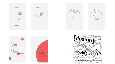
1. Axial System

Fig.1.1.11 Axial - Final | Week 3 (8/5/24)

Fig.1.1.12 Radial - Final | Week 3 (8/5/24)

Fig.1.1.13 Dilatational - Final | Week 3 (8/5/24)

Fig.1.1.14 Random - Final | Week 3 (8/5/24)

Fig.1.1.15 Grid - Final | Week 3 (8/5/24)

Fig.1.1.16 Modular - Final | Week 3 (8/5/24)

Fig.1.1.17 Transitional - Final | Week 3 (8/5/24)

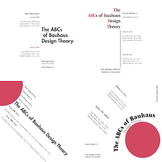
Fig.1.1.18 Bilateral - Final | Week 3 (8/5/24)
Fig.1.1.19 Final Typographic System - pdf | Week 3
(8/5/24)
Fig.1.1.20 Final Typographic System (grids) - pdf | Week 3
(8/5/24)
Exercise 2 : Type and Play
In this task, we're tasked with selecting an image of either a man-made
object, structure, or a natural element. From there, we'll identify
letterforms within the image, digitize and refine them. Once the
letterforms are completed, we'll integrate them with the original image to
enhance the interplay between the text and visual elements, creating a
symbiotic relationship.
Part 1 | Finding Type
I searched for natural images on Pinterest that could potentially be
used for this project.I chose two: one featuring clean ocean waves and
the other showing a brick wall overgrown with green moss.

Fig.1.2.1 Chosen Image
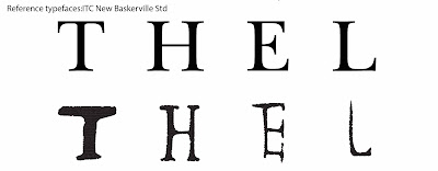
I extracted letters such as "F, K, Y, C" and "T, H, E, L" from the
images. After thorough consideration, I opted for the picture showing
a brick wall covered in vibrant green moss as my final choice.

Fig.1.2.2 Deconstructing letterforms
1. Letterform Extraction

Fig.1.2.3 Traced letters - "T, H, E, L"

Fig.1.2.4 Extraction of letterforms - "T, H, E, L"
I selected ITC New Baskerville Std as my reference font because of its
classic and elegant design. Its refined serifs and balanced proportions
complement the organic textures and natural elements in the images,
ensuring a harmonious blend between the text and visual elements.

Fig.1.2.5 Reference typefaces:ITC New Baskerville Std
3. Refined Letterforms
Attempt 1: I slightly adjusted the orientation of the font and
removed some minor extraneous elements to better align with the overall
design aesthetic. These adjustments help maintain the integrity of the
letterforms while enhancing their clarity and visual appeal.

Fig.1.2.6 Refinement #1
Attempt 2: Based on ITC New Baskerville Std as my reference font, I made
several modifications to ensure a cohesive integration with the
visual elements. These changes include refining the serifs and
adjusting the spacing to harmonize with the natural textures and
organic shapes found in the images.

Fig.1.2.7 Refinement #2

Fig.1.2.8 Refine Reference Typeface
Final Letterforms

Fig.1.2.9 Final Letterforms | Week 4 (16/5/24)

Fig.1.2.10 Compiled Process | Week 4 (16/5/24)
Fig.1.2.11 Final Finding Type - pdf | Week 4 (16/5/24)
Part 2 | Type and Image
After completing the alphabet grid, we were instructed to utilize it
in designing a mock movie poster. The primary aim is to strengthen
the relationship between the letters and the image we've chosen for
editing, ensuring they interact harmoniously to produce a cohesive
visual impact.

Fig.1.2.12 Selected Images for Poster
Final Poster

Fig.1.2.13 Final Poster | Week 4 (18/5/24)
Fig.1.2.14 Final Poster - pdf | Week 4 (18/5/24)
Feedbacks
Week 1 (24/4/24):
The primary focus is on getting acquainted with the module by attending a
thorough briefing and watching all assigned lectures attentively. It's
crucial to absorb the content effectively and document key points in the
e-portfolio for future reference.
Week 2 (1/5/24):
Attention shifts towards maintaining the e-portfolio's quality and clarity.
Regular updates ensure that information remains current, while organising
content clearly enhances its accessibility. By adhering to guidelines such
as limiting graphical elements, avoiding sharp angles, and ensuring precise
alignment, the layout achieves a polished and professional appearance.
Week 3 (8/5/24):
completing Task 1 and Task 2 signifies significant progress in applying the
knowledge gained from lectures and maintaining an exemplary e-portfolio.
Each week builds upon the foundation laid in the previous one, culminating
in a thorough understanding of the module's content and a well-crafted
representation of it in the e-portfolio.
Week 4 (14/5/24):
Emphasised the creation of a movie poster that maintains a clean and
uncluttered design, with the logo integrated while ensuring the title and
image stand out as focal points.
Reflections
Experience:
Working on these exercises was both challenging and rewarding. Developing
multiple typographic systems in a short time was difficult but pushed me
to experiment and improve. Creating typefaces from images in the second
task was particularly enjoyable and allowed for more creative exploration.
Observations:
I observed the importance of balance and effective use of white space in
typographic design. Using grids and guides helped create coherent layouts.
In the second task, it was crucial to preserve the unique characteristics
of the original images in the letterforms.
Findings:
These exercises taught me the balance between creativity and structure in
design. I learned that a well-defined system enhances creativity and that
maintaining consistency within a typeface family is essential. This
experience deepened my understanding of typographic principles and
prepared me for future projects.
Further Readings
- "Typographic Systems" by Kimberly Elam

Fig. "Typographic Systems" by Kimberly Elam
"Typographic Systems" is a book by Kimberly Elam that explores the
fundamental elements of typography and their impact on design. Through
practical examples and illustrations, it teaches how to create effective
typographic systems for visually appealing and functional designs. This book
is a valuable resource for designers and students looking to master
typography principles.
- Article | Finding Type: A Novel Typographic Exercise

Fig. Finding Type: A Novel Typographic Exercise
[link]
- "The Vignelli Canon" by Massimo Vignelli

Fig."The Vignelli Canon" by Massimo Vignelli
"The Vignelli Canon" is a design manual by Italian designer Massimo Vignelli,
offering valuable insights into design principles and methodologies, including
typography, color, and layout. It emphasizes standards and clarity in design,
making it a valuable resource for designers at all levels.
- "Just My Type" by Simon Garfield

Fig."Just My Type" by Simon Garfield
"Just My Type" is a book about fonts and typography written by British
author Simon Garfield. It provides a humorous exploration of various types
of fonts, delving into their history, design principles, and applications.
The book presents the significance of fonts in our daily lives in an
engaging and light-hearted manner, making it a delightful read for those
interested in fonts and typography.
QUICK LINK


Comments
Post a Comment