Chan Xiang Lam | 0358400
Typography | Bachelor of Design (Honours) in Creative Media
Task 1 | Exercises 1 (Type Expression ) & Exercises 2 ( Text Formatting)
LECTURES
Lecture 1 | Briefing / Introduction
1.1 What is Typography?
- Typography can be defined as the art of creating letterforms, involving
elements like letter construction, grid usage and classic proportions. It is
use to designs the shape of letters that you see in printed or digital media.
Therefore, typography involves the creation of typefaces or type families.
1.2 Type History
1. Early Evolution of Roman Letters 1
Early evolution of roman letters specifically focusing on Roman capital
letters and their transition into more practical writing styles. It introduces
three distinct handwriting styles : square capitals, rustic capitals and roman
cursive.
-
Square Capitals: Theses were formal letters influenced by
inscriptional forms. They were meticulously drawn but written more quickly
than stone inscriptions.
Figure 1.2.1 Example of Square Capitals
-
Rustic Capitals: These were narrower and simpler letterforms,
developed to save space and time in producing less important documents.
Figure 1.2.2 Example of Rustic Capitals
-
Roman Cursive: This was a more fluid and speedy handwriting style
suitable for business transactions, bookkeeping and correspondence. It
became the standard for everyday use until around AD 500.
Figure 1.2.3 Example of Roman Cursive
2. First Alphabet
The text traces the early development of writing from simple tokens
to symbols, and then to phonetic alphabets. It highlights the
contributions of civilizations like the Egyptians and Phoenicians in this
evolution. The Phoenicians introduced the first phonetic alphabet focused on
practicality Phoenicians introduced the first phonetic alphabet
focused on practicality and record-keeping. The Greeks further refined the
alphabet by adding vowels and curves. The Latin alphabet, based on Greek
letterforms, was adopted and adapted by the Romans. Roman capital
letters, used in monumental inscriptions, have influenced the
design of capital letters for over two millennia.
Figure 1.2.4 Example of First Alphabet
Lecture 2 | Development / Timeline
2.1 Early Letterform development: Phoenician to
Roman
In the early phases of writing, people used tools like sharpened sticks on wet
clay or chisels on stone to create letters. The uppercase letterforms, which
remained prominent for about 2000 years, originated from these basic tools and
materials. They were formed by combining straight lines and circular segments
due to the limitations of the available writing materials and tools.
Figure 2.1.1 Example of Phoenician Letterform
The Greeks revolutionized writing by introducing 'boustrophedon', a method
where text was read alternately from right to left and left to right. Unlike
the Phoenicians and other Semitic cultures that wrote exclusively right to
left, this style mimicked the ox's ploughing pattern.
This change in reading direction also led to significant adjustments in
letterform orientation, impacting the evolution of writing systems in a
profound way.
Figure 2.1.2 Example of Greek Fragment
Etruscan and later Roman craftsmen, especially those working with
marble, had a meticulous approach to lettering. They would initially paint the
letter shapes before carving them, ensuring specific details like the
transition in stroke thickness from vertical to horizontal and widening
strokes at the letter's start and end. These painted attributes were
faithfully replicated in the final carved letterforms.
Figure 2.1.3 Example of letterform from Phoenician to Roman
2.2 Hand script from 3rd - 10rd century
C.E.
The 3rd to 10th centuries C.E., various styles of
handwriting emerged:
-
Square Capitals: Like Roman inscriptions, these used varied
stroke widths with a reed pen at a 60° angle.
Figure 2.2.1 Example of Square Capital
-
Rustic Capitals: Condensed version of square capitals for
faster writing and more words per parchment.
Figure 2.2.3 Example of Rustic Capitals
-
Cursive Hand: Simplified for speedy everyday transactions.
Figure 2.2.4 Example of Cursive Hand
-
Uncials: Incorporated elements from Roman cursive, enhancing
readability at small sizes.
Figure 2.2.5 Example of Uncials
-
Half-Uncials: Formalized cursive hand with ascenders and
descenders, introducing lowercase letterforms after 2000 years.
Figure 2.2.6 Example of Half-Uncials
-
Charlemagne: In 789, mandated standardization of ecclesiastical
texts, led by Alcuin of York, shaping calligraphy for a century.
Figure 2.2.7 Example of Carolingian minuscule
2.3 Blackletter to Gutenberg's type
Regional script variations followed Charlemagne's empire dissolution.
Blackletter (textura) rose in the north for its condensed style, while the
south favored the rounder 'rotunda'. Italy adopted the humanistic script.
Gutenberg's diverse skills in engineering, metalsmithing, and chemistry
enabled him to replicate the scribe's hand, particularly Blackletter, using
specialized type molds and brass matrices for each letter.
Figure 2.3.1 Example of Blackletter
2.4 Text type classification
Figure 2.4.1 Example of text type classification from 1450-1990
Lecture 3 | Text / Tracking: Kerning and Letterspacing
Definitions for kerning, letterspacing and tracking in typography :
- Kerning : Adjusting space between individual letters.
Figure 3.1.1 Usage of kerning
-
Tracking : Encompasses both adding and removing space in a
word or sentence for overall spacing adjustment, making it a broader
term that includes kerning and letterspacing.
Figure 3.1.2 Usage of normal tracking, loose tracking and tight
tracking
-
Letterspacing : Adding space between all the letters in a
word or sentence.
Figure 3.1.3 Example of Normal tracking, Loose tracking and
Tight tracking
3.2 Text / Formatting Text
-
Flush left: Resembles handwriting with consistent starting
points and varying line endings. Even spacing between words creates a
uniform appearance.
Figure 3.2.1 Example of Flush left
-
Centered: Creates symmetry, turning text into shapes. Careful
line breaks are needed to prevent jagged edges.
Figure 3.2.2 Example of Centered
-
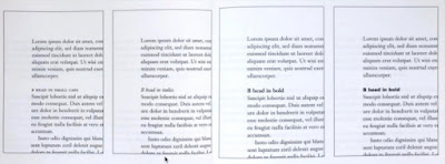
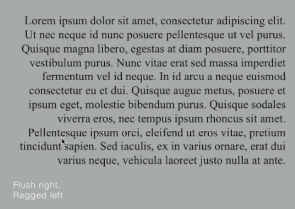
Flush right: Emphasizes line endings, useful for situations
like captions where orientation matters.
Figure 3.2.3 Example of Flush right
-
Justified: Achieves symmetry by adjusting spacing between
words and letters. However, it can result in "rivers" of white space,
requiring careful line breaks and hyphenation for correction.
Figure 3.2.4 Example of Justified
3.3 Text / Texture
Typefaces goes beyond history. It's vital to choose one that matches the
message. Consider the texture too. Fonts with larger x-height or bolder
strokes appear denser on the page. This sensitivity is key for effective
layouts.
Figure 3.3.1 Anatomy of A Typeface
Figure 3.3.2 Different typefaces with different grey scale
3.4 Text / Leading and Line Length
-
Text size: Text type should allow for easy reading at arm's
length, as if holding a book in your lap.
-
Leading: Adequate leading prevents vertical eye movement, while
avoiding excessive leading prevents distracting striped patterns.
-
Line length: Line length along with type size and leading,
influences appropriate leading. Aim for 55-65 characters per line, as
extremely long or short lines hinder readability.
Figure 3.4.1 Left: Bad Leading Right: Good Leading
3.5 Text / Type Specimen Book
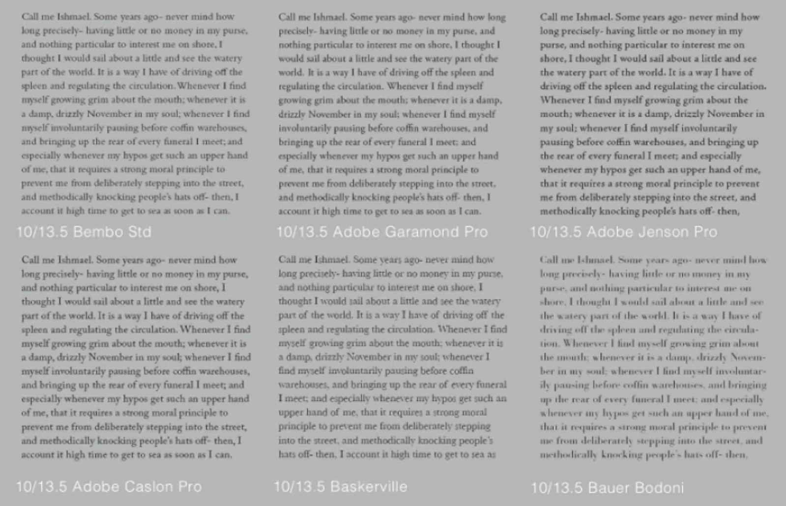
A type specimen book presents typefaces in various sizes for evaluation.
Without printed samples, it's challenging to make an informed choice. Final
decisions for on-screen reading are best made on screen. A type specimen book
(or screen-compatible ebook) serves as a precise reference for type, size,
leading, line length, and more.
Figure 3.5.1 Sample Type Specimen Sheet
Lecture 4 |
Text / Indicating Paragraphs
There are several options for indicating paragraphs
:
-
Pilcrow - The "pilcrow" (¶) symbol, derived from
medieval manuscripts, is now rarely used.
-
Line Space - If the line space is set at 12pt, the paragraph
space will also be 12pt, ensuring consistent alignment across text
columns.
Figure 4.1.2 Line Space
Figure 4.1.2 Line Space vs Leading
-
Standard Indentation - Which is usually equivalent to either the
line spacing or the point size of the text.
Figure 4.1.3 Standard Indentation
-
Extending Paragraphs - While resulting in unusually wide text
columns, may be chosen for compelling compositional or functional
reasons, despite potential challenges.
Figure 4.1.4 Extended Paragraphs
4.2 Text / Widows and Orphans
In traditional typesetting, there are two unpardonable gaffes widows and
orphans.
-
Widows: These are short lines of type left alone at the end
of a column of text.
-
Orphans: These are short lines of type left alone at
the start of a new column.
Figure 4.2.1 Example of Widows and Orphans
In traditional typesetting, widows and orphans are big no-nos,
especially in justified text. While other alignments are more
forgiving to widows, orphans are still a concern. To fix
widows, tweak line endings to avoid short lines. To tackle
orphans, pros make sure no column starts with the last line of
a paragraph.
4.3 Text / Highlighting Text
Different types of emphasis necessitate varying
levels of contrast within a column of text. This principle guides
how we highlight specific content effectively.
Figure 4.3.1 Example of Text Highlight
In this example, the sans serif font Univers has been reduced by 0.5
to align its x-height with the serif typeface, resulting in a font
size of 8 (originally 7.5).
Figure 4.3.2 Example of Reduced The Sans Serif Font (Univers)
Aligned figures (numbers) and all-capital
acronyms embedded in text are also reduced by 0.5 to maintain visual
consistency with the rest of the text.
Figure 4.3.3 Example of Reduce size of text to
ensure visual cohesion of text
When highlighting text with a colored background, it's crucial to
maintain the left reading axis (as shown in the right example) to
ensure optimal readability.
Figure 4.3.4 Example of Highlighted Text Through Coloured Background
Occasionally, certain typographic elements need to extend outside
the left margin of a column of text (rather than indenting) to
preserve a strong reading axis.
Figure 4.3.5 Example of Typographic elements outside the left margins
Quotation marks, like bullets, can disrupt the left reading
axis by creating a noticeable indent. A comparison between the
indented quote at the top and the extended quote at the bottom
illustrates this.
Figure 4.3.6 Example of Using Quotation Marks
4.4 Text / Heading within Text
Text within chapters can be subdivided into different levels of
importance, labeled as A, B, and C in the provided visuals. The
typographer's responsibility is to ensure that these headings
effectively communicate their relative importance and their
relationship to one another to the reader.
"A" heads mark clear breaks in topics, presented larger in
small caps and bold. The fourth example extends the A head to the
left.
Figure 4.4.1 'A' head
"B" heads, subordinate to A, introduce supporting
arguments or examples. They're in small caps, italic, bold serif, and
bold sans serif.
"C" heads, less common, emphasize specific
facets in B head text. They blend smoothly, in small caps, italics,
serif bold, and san serif bold. An em space follows for separation.

Figure 4.4.3 'C' head
4.5 Text / Cross Alignment
Aligning headlines and captions with text type enhances the
page's architectural structure and reinforces its vertical
rhythms. In the provided example, four lines of caption type
with 9 points leading align with three lines of text type with
13.5 points leading.
Figure 4.5.1 Example of Cross Alignment of text
Below, one line of headline type aligns with two lines of
text type, and on the bottom left, four lines of headline type
align with five lines of text type.
Figure 4.5.2 Example of Cross Alignment of text
Lecture 5 |
Basic / Describing letterforms
Typography, like any long-evolving craft, employs a range of
technical terms, primarily to describe distinct elements of
letterforms. Familiarizing oneself with this lexicon is
beneficial, as it facilitates the identification of specific
typefaces by understanding their component parts.
-
Baseline: The imaginary line serving as the
visual base of letterforms.
-
Median: The imaginary line that defines the
height of letterforms.
-
X-height: The height of the lowercase 'x' in any
typeface.
Figure 5.1.1 Example of Baseline, Median and
X-height
-
Stroke: Any line defining the basic letterform.
Figure 5.1.2 Example of Stroke
-
Apex/Vertex: Point created by joining
two diagonal stems.
Figure 5.1.3 Example of Apex/Vertex
-
Arm: Short strokes off the stem of a
letterform, either horizontal or inclined upward.
Figure 5.1.4 Example of Arm
-
Ascender: Portion of the stem projecting
above the median.
Figure 5.1.5 Example of Ascender
-
Barb: Half-serif finish on some curved
strokes.
Figure 5.1.6 Example of Barb
-
Bowl: Rounded form describing a counter,
which can be open or closed.
Figure 5.1.7 Example of Bowl
-
Bracket: Transition between the serif
and the stem.
Figure 5.1.8 Example of Bracket
Figure 5.1.9 Example of Cross Stroke
-
Crotch: Interior space where two strokes
meet.
Figure 5.1.10 Example of Crotch
-
Descender: The segment of a lowercase
letterform's stem that extends beneath the baseline.
Figure 5.1.11 Example of Descender
-
Ear: Stroke extending from the main stem
or body of the letterform.
Figure 5.1.12 Example of Ear
-
Em/en: Originally referred to the width
of an uppercase M; now refers to distances equal to
the size of the typeface.
-
Finial: Rounded non-serif terminal to a
stroke.
Figure 5.1.13 Example of Finial
-
Leg: Short stroke off the stem of a
letterform, either at the bottom or inclined
downward.
Figure 5.1.14 Example of Leg
-
Ligature: Character formed by combining
two or more letterforms.
Figure 5.1.15 Example of Ligature
-
Serif: Right-angled or oblique foot at
the end of a stroke.
Figure 5.1.16 Example of Serif
-
Link: Stroke connecting the bowl and
loop of a lowercase G.
Figure 5.1.17 Example of Link
-
Loop: In some typefaces, the bowl created
in the descender of the lowercase G.
Figure 5.1.18 Example of Loop
Figure 5.1.19 Example of Shoulder
-
Spine: Curved stem of the letter S.
Figure 5.1.20 Example of Spine
-
Spur: Extension articulating the
junction of the curved and rectilinear stroke.
Figure 4.0.21 Example of Spur
-
Stem: Significant vertical or oblique
stroke.
Figure 5.1.22 Example of Stem
-
Stress: Orientation of the letterform,
indicated by the thin stroke in round forms.
Figure 5.1.23 Example of Stress
-
Swash: Flourish extending the stroke of
the letterform.
Figure 5.1.24 Example of Swash
-
Tail: Curved diagonal stroke at the
finish of certain letterforms.
Figure 5.1.25 Example of Tail
-
Terminal: Self-contained finish of a
stroke without a serif. This term encompasses
various shapes, including flat, flared, acute,
grave, concave, convex, rounded, and more.

Figure 5.1.26 Example of Terminal
5.2 Basic / The font
A full font of a typeface includes more than just
the 26 letters, including numerals and various
punctuation marks. It's crucial to work with a full font
and understand how to use it effectively.
-
Uppercase: Capital letters, including accented
vowels, special characters like ç and ñ, and
ligatures like æ and œ.
Figure 5.2.1 Example of Uppercase
-
Lowercase: Includes the same characters as
uppercase.
Figure 5.2.2 Example of Lowercase
Small Capitals: Uppercase letterforms scaled to the
x-height of the typeface. Found in serif fonts,
they're often part of the expert set. Be cautious of
artificially generated small caps.
Figure 5.2.3 Small Capitals
-
Uppercase Numerals (Lining Figures): Same height
as uppercase letters, suitable for tabular content
or situations requiring uppercase.
Figure 5.2.4 Example of Uppercase Numerals
-
Lowercase Numerals (Old Style Figures/Text
Figures): Set to x-height with ascenders and
descenders, best used alongside upper and
lowercase letterforms. Less common in sans serif
typefaces.
Figure 5.2.5 Example of Lowercase Numerals
Italic: Typically paired with fonts, inspired by
fifteenth-century Italian cursive handwriting. Oblique
variants are based on the roman form of the typeface.

Figure 5.2.6 Example of Italic fonts

Figure 5.2.7 Italic vs Roman
Punctuation and Miscellaneous Characters:
While all fonts include standard punctuation marks,
miscellaneous characters can vary from one typeface to
another. Familiarize yourself with all the characters
available in a typeface before selecting it for a specific
project.
Figure 5.2.8 Punctuation and Miscellaneous Characters
Ornaments:
These are decorative elements often used as flourishes in
invitations or certificates. They are typically provided as
a font within a larger typeface family. Only a few
traditional or classical typefaces include ornamental fonts
as part of the complete typeface family (such as Adobe
Caslon Pro).
Figure 5.2.9 Ornaments
5.3 Basic / Describing
typefaces
-
Roman: Uppercase forms in this style are derived
from inscriptions on Roman monuments. A slightly lighter
stroke in the Roman style is known as 'Book'.
-
Italic: Named for 15th-century Italian
handwriting, on which the forms are based. Oblique
styles are based on the Roman form of the typeface.
-
Boldface: Characterized by a thicker stroke than
the Roman form. Depending on the relative stroke widths,
it can also be termed 'semibold', 'medium', 'black',
'extra bold', or 'super'. In some typefaces (like
Bodoni), the boldest rendition is referred to as
'Poster'.
-
Light: Features a lighter stroke than the Roman
form. Even lighter strokes are called 'thin'.
-
Condense: A condensed version of the Roman form.
Extremely condensed styles are often referred to as
'compressed'.
-
Extended: An extended variation of a Roman font.
Figure 5.3.1 Roman, Italic, Boldface, Light, Condense
and Extended in letterform
5.4 Basic / Comparing typefaces
The 10 typefaces mentioned in the slide cover 500 years of design
evolution. Designers aimed for readability and contemporary style,
and these typefaces excelled, enduring for decades and sometimes
centuries. They reflect how we think, read, write, and print.
Studying them thoroughly is key for beginner typographers, forming
a strong base for early projects and enabling appreciation and
effective use of other typefaces encountered later on.

Figure 5.4.1 Example of 10 typefaces
Typefaces differ in various ways, from their shapes to their emotions.
Understanding these nuances helps shape preferences when choosing
typefaces. Many designers have a few favorites, and some build careers
around just one or two, showing the impact of personal typeface choices.
Figure 5.4.2 Example of "a" and "R"
Lecture 6 |
Letters : Understanding Letterforms
Uppercase letterforms may initially seem symmetrical, but upon closer
inspection, subtle asymmetries become apparent. In examples like Baskerville
and Univers, it's evident how much precision a type designer invests in
crafting letterforms that achieve both internal balance and individual
expressiveness.
Figure 6.1.1 Baskerville 'A'
Comparing the lowercase 'a' in Helvetica and Univers, seemingly similar
sans-serif typefaces, unveils distinct nuances. The finishing of stems and the
meeting point of bowls with stems highlight the unique character of each
typeface.
Figure 6.1.3 Helvetica vs Univers
6.2 Letters / Maintaining x- height
The x-height primarily determines the size of lowercase letterforms. It's
important to note that curved strokes, like those in the letter 's', must
extend above the median (or descend below the baseline) to visually match
the height of the vertical and horizontal strokes they connect with.
Figure 6.2.1 Median & Baseline
6.3 Letters / Form / Counterform
Understanding counterforms is crucial. It refers to the space within and
often between the strokes of a letter. It's especially relevant when dealing
with letterforms like lowercase 'r' that lack traditional counters. Mastery
of counters ensures text reads cohesively and legibly.
Figure 6.3.1 Forms and Counter forms of letterforms
Examining letters up close reveals the delicate interplay between form and
counter. It offers insight into a letterform's distinctive attributes and the
art of letter-making. Notably, the 'S' maintains its identity at every scale,
while the 'g' tends to lose definition when isolated from the complete
letterform.
Figure 6.3.2 Helvetica vs Baskerville
6.4 Letters / Contrast
The fundamental principles of Graphic Design seamlessly apply to typography.
Consider the powerful dynamic of contrast, as demonstrated through various
examples. This interplay includes small vs. organic, large vs. machined,
small vs. dark, and large vs. light. These variations showcase the
versatility of contrast in design.
Lecture 7 |
Letters : Typography in Different Medium
In the past, typography was considered complete once a
publication was printed. Skilled typesetters and designers
ensured good typography and readability.
Today, typography isn't confined to paper. It appears on
various screens, influenced by factors like operating systems,
fonts, devices, and screen settings. This means our experience
of typography can vary based on how the page is displayed in a
web browser.
7.1 Print Type VS Screen Type
Typefaces like Caslon, Garamond, and Baskerville are excellent
choices for print. They offer elegance, intellectual appeal,
and readability even at small sizes. These classic typefaces
are versatile and easy to work with, making them ideal for
typesetting in print. The designer's role is to ensure the
text is smooth and flows well, enhancing the reading
experience.
Figure 7.1.1 Type of Print
Typefaces designed for the web undergo optimizations for
improved readability and performance on screens. This
includes adjustments like taller x-heights, wider
letterforms, open counters, heavier strokes, and reduced
contrast. Spacing is also increased, particularly for
smaller sizes. These modifications enhance character
recognition and overall readability in digital environments
such as websites, e-books, e-readers, and mobile devices.
Figure 7.1.2 Type for Screen
A hyperlink is an interactive element, often text or an
image, allowing users to click and navigate to another
document or section. Commonly blue and underlined on web
pages, they change the cursor to a hand pointer when
hovered over.
On-screen, 16-pixel text is similar in size to printed text
in books or magazines for comfortable reading distance.
Printed books often use around 10-point font for close
reading, while on-screen text for arm's length should be at
least 12 points, approximately 16 pixels.
- System Fonts for Screen / Web Safe Fonts
System Fonts or Web Safe Fonts are pre-installed fonts on
various operating systems like Windows, MacOS, and
Android. They ensure consistent display across devices.
Choosing an uncommon, paid font for a website might result
in defaulting to basic fonts like Times New Roman if it's
not available on the visitor's device. Web safe fonts like
Open Sans, Lato, Arial, Helvetica, Times New Roman,
Verdana, and Georgia guarantee compatibility across
different operating systems.
- Pixel Differential Between Devices
The size and proportion of
text on screens vary due to differences in pixel sizes. For
example, 100 pixels on a laptop screen appear differently
than on a larger 60" HDTV. Additionally, there can be
significant variation even within a single type of device.
Figure 7.1.3 Pixel Differential between Devices
7. 2 Static VS Motion
Static typography has limited expressiveness, mainly
using features like bold and italic for emphasis. It's
commonly seen in designs like billboards and posters for
informational, promotional, and formal purposes, relying
on emotional connections with viewers.
Motion typography involves moving text in media like
films and videos. It brings letterforms to life
through animation, creating dynamic visual
experiences. Often used in film title credits and
branding, it synchronizes text movement with
soundtracks, enhancing impact and setting the mood for
the content.
Figure 7.2.1 Static vs Motion
INSTRUCTIONS
EXERCISES
Task 1| Exercises 1 - Type Expression
In this Exercise , we were tasked with creating type expressions using a
set of words: Dizzy, Electric, Fire, Gun, Cry, and Freeze. We were limited
to using only ten typefaces: Adobe Caslon Pro, Bembo, Bodoni, Futura, Gill
Sans, Garamond, New Baskerville, Janson, Serifa, and Univers. The
objective was to convey the meaning of each word through typography and
fonts.
1. Sketches
For this task, I selected “Fire”,
“Slide”, “Gun” and “Electric” in my sketches.We were instructed to
select four out of the seven words ("Dizzy," "Electric," "Fire," "Cry,"
"Gun," "Slide," "Freeze") and sketch their meanings. Graphic elements
were not permitted, and our options were confined to the ten specified
typefaces.
Figure 1.1.1 Sketch of my Type Expression
Before transitioning to Adobe Illustrator CC, I first sketched them out,
aiming to capture the design concepts that came to mind. Typeface
selection wasn't a focal point during the initial sketching of the
words. Rather, the emphasis was on grasping the essence of the intended
design. Subsequently, I proceeded to digitize the type expressions and
made minor adjustments to the designs.
2. Digitisation
For the word "Slide," I conveyed a sense
of fluidity through the arrangement and form of the font, creating the
impression that the text itself was gliding forward. This design evoked
a feeling of speed and motion.
Figure 1.1.2 Digitising the word "slide"
In the case of "Gun," I opted for a font that exuded solidity and
strength, utilizing strokes and lines to convey the weightiness and
power associated with weaponry. This design ensured that viewers could
instantly grasp the intended meaning of the word.
Figure 1.1.3 Digitising the word "gun"
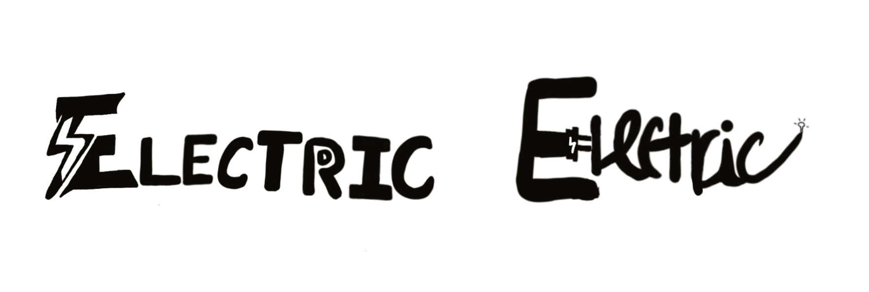
With "Electric," I utilized a cursive font to convey the sense of
electric flow. Through adjustments in letter spacing and arrangement,
this created a visual effect that evoked the visual flow of electrical
current.
Figure 1.1.4 Digitising the word "electric"
Finally, for "Fire," I selected a font that appeared as if it had been
charred to ashes. Through the form and arrangement of letters, I
created a visual effect resembling the letters being consumed by the
fire.
Figure 1.1.5 Digitising the word "fire"
Final Outcome
Figure 1.1.6 Final Type Expression - jpg | Week 3 (9/10/23)
Figure 1.1.7 Final Type Expression -pdf | Week 3 (9/10/23)
3. Animation
After digitizing four different words,
I ultimately chose "Electric" as my final animated word.
Figure 1.1.8 progress of animation using Adobe Illustrator
In the video, Mr. Vinod proficiently demonstrated how to use Adobe
Illustrator and Photoshop to create a basic type animation. Throughout
the production process, I identified some areas for improvement,
particularly in achieving the desired electric-like effect. To address
this, I recognized the necessity of adding more frames and adjusting
the letter positions to enhance the overall visual impact.
Figure 1.1.9 progress of animation using Photoshop
And lastly, here is the ultimate result of my animation for the word
"Electric".
Final Animation
Figure 1.1.10 Final Animation
Task 1| Exercises 2 - Text Formatting
1. Minor exercises on kerning and tracking
For Exercise 2, we will be crafting a conclusive layout that encompasses
an array of text formatting elements, including kerning, leading,
paragraph spacing, alignment, and more. This task aims to hone our
proficiency in spatial organization and refining information hierarchy.
Adobe InDesign will be our tool of choice for this exercise, enabling us
to skillfully manipulate these aspects for a polished final layout.
Figure 1.2.1 with kerning
Figure 1.2.2 without kerning
2. Exercises on Text Formatting
Figure 1.2.3 Progress of text
FINAL OUTCOME
HEAD
Font/s: Univers LT Std
Type Size/s: 30pt , 18pt
Leading: 18pt
Paragraph spacing: -
BODY
Font/s: Univers LT Std
Type Size/s: 9.5pt
Leading: 12
Paragraph spacing: 4.233mm
Characters per-line: 60
Alignment: Justify with last line aligned left
Margins: 38mm top, 12.7mm left + 12.7mm right + 34.5mm
bottom
Columns: 4
Gutter: 5mm
Figure 1.2.4 Text formatting layout - jpg | Week 5
(23/10/23)
Figure 1.2.5 Final Text formatting layout - pdf | Week 5 (23/10/23)
Figure 1.2.6 Text formatting layout (grids) - jpg | Week 5 (23/10/23)
Figure 1.2.7 Final Text formatting layout (grids) - pdf | Week 5 (23/10/23)
FEEDBACKS
Week 3 (9/10/23) :
General Feedback - I sketched four distinct words: "Fire,"
"Slide," "Gun," and "Electric." This exercise provided an opportunity
to delve into the realm of font design and explore how to visually
represent these words.
Specific Feedback - Regarding "Electric," I realized I
needed to minimize the use of graphical elements and opt for a more
suitable typeface. While preserving the original concept, I executed it
differently. As for "Fire," I learned that any form of distortion,
including curving edges, was not permissible. After refining my design,
I found it to be an improvement from the initial version.
Week 3 (9/10/23) :
General Feedback - During this week, Mr. Vinod provided a
comprehensive review of the completed exercises by all students,
offering invaluable feedback. After reviewing our sketches for Task 1,
he directed us to an instructional video on digitizing artwork using
Adobe Illustrator.
Specific Feedback - Mr. Vinod offered invaluable
guidance in correcting errors within my class exercise. Specifically for
"Electric," he recommended reducing negative space and refining its
composition to create a more impactful visual.
Week 4 (16/10/23) :
General Feedback - Expressions match the meaning of the
words well, showcasing strong compositional skills. It's important to
exercise restraint with distortion and consider how each chosen font
complements the meaning of the respective word. The font selection
should harmonize with the essence of the word being worked on.
Specific Feedback - Mr. Vinod advised me to focus on
adjusting the spacing for a better result. Regarding the animation of
"Electric," he pointed out that it is currently too fast. He suggested
allowing the type to descend more slowly, enabling viewers to observe
the words on the ground elongating. This adjustment will enhance the
overall visual impact.
Week 5 (23/10/23) :
General Feedback - Use InDesign to complete Task 1 Exercise
2 - Text Formatting. Good layouts, ragging, and cross alignments. Font
size corresponds to the leading. No hyphenations, widows, or orphans
present.
Specific Feedback - Make sure all layouts are neat, don't
make the text too messy. Avoid using two different fonts, and adjust the
spacing of the fonts appropriately—neither too far apart nor too close
together.
REFLECTIONS
Experience:
Over the course of this class, I've delved into the intricacies of
typography. The initial stages involved sketching, which presented a
challenge due to the limited use of typefaces and the absence of
graphical elements. Coming up with unique ideas amidst these
constraints was a stimulating exercise. As we transitioned to the
digitalization phase, I encountered a learning curve with Adobe
Illustrator, having been more accustomed to Photoshop. Navigating
through formatting and arrangement nuances during the practical
sessions was a worthwhile endeavor. Additionally, the text formatting
exercise proved unexpectedly demanding, particularly in grasping the
baseline grid intricacies.
Observations:
Throughout this journey, I've come to appreciate the symbiotic
relationship between typography and various design elements.
Alignment, for instance, emerges as a pivotal factor in establishing
hierarchy and visual weight. It's fascinating to witness how letters
can morph into shapes or images, adding depth to the visual narrative.
Elements like movement, scale, contrast, and value also play crucial
roles in shaping the overall typographic composition.
Findings:
This exploration into typography has illuminated the depth of its
rules and terminology, requiring a diligent approach to absorb and
apply them effectively. The process has underscored the importance of
meticulous scrutiny of every detail, coupled with a rigorous
self-critique, as the path to refinement. Simple typefaces, often
taken for granted, reveal a rich design heritage, each carrying a
profound and layered history. Designing and arranging type entails a
multifaceted consideration of factors that contribute to the overall
visual impact. Through this journey, I've unearthed a newfound
appreciation for the art and science of typography, realizing that
even within constraints, creativity finds its most compelling
expressions.
FURTHER READING
- "A Type Primer" by John Kane
Figure "A Type Primer" by John Kane
After reviewing the books Mr. Vinod provided, I have chosen "A Type
Primer" by John Kane as my selection. This book likely offers a
comprehensive understanding of typography, encompassing font history,
classification, and anatomy. It also imparts fundamental principles
for selecting typefaces, which play a pivotal role in layout and
design, conveying unique emotions and atmospheres.
The insights provided in the book offer practical advice on selecting,
combining, and applying typefaces in real-world design scenarios,
along with considerations for typesetting. This knowledge instills
confidence in font selections and ensures they align with the demands
of the design project.
-
"The Vignelli Canon" by Massimo Vignelli
Figure "The Vignelli Canon" by Massimo Vignelli
"The Vignelli Canon" is a design manual by Italian designer Massimo
Vignelli, offering valuable insights into design principles and
methodologies, including typography, color, and layout. It emphasizes
standards and clarity in design, making it a valuable resource for
designers at all levels.
- "Just My Type" by Simon Garfield
Figure "Just My Type" by Simon Garfield
"Just My Type" is a book about fonts and typography written by British
author Simon Garfield. It provides a humorous exploration of various
types of fonts, delving into their history, design principles, and
applications. The book presents the significance of fonts in our daily
lives in an engaging and light-hearted manner, making it a delightful
read for those interested in fonts and typography.
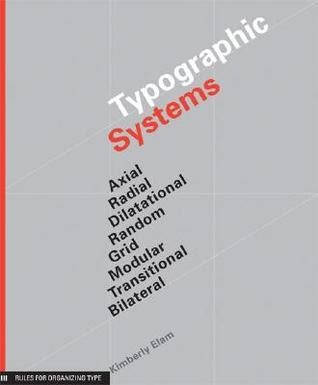
- "Typographic Systems" by Kimberly Elam
Figure "Typographic Systems" by Kimberly Elam
"Typographic Systems" is a book by Kimberly Elam that explores the
fundamental elements of typography and their impact on design.
Through practical examples and illustrations, it teaches how to
create effective typographic systems for visually appealing and
functional designs. This book is a valuable resource for designers
and students looking to master typography principles.
Figure "Typography Referenced"
"Typography Referenced" is a comprehensive reference book on font
design and layout. It covers the history, technical details, and
practical aspects of typography. The book also provides valuable
examples and advice for designers looking to effectively use fonts
in their work. It's a valuable resource for anyone interested in
the art of typography.
top^
QUICK LINK


Comments
Post a Comment